We were given four influential editorial / graphic designers, and four influential typographic designers to look into as our research task. Though only required to look at 2 of each, I wanted to look at all 8 artists as I felt it necessary to understand what has been done, and what has worked. From looking at these designers, I actually stumbled across more, such as Alexey Brodovitch, Alan Fletcher and Paula Scher, who I also looked into. I feel it's important to research as much as possible to understand the area of Design in more depth.
Neville Brody
He has stated, "I think the objects I leave behind are not the legacy I am interested in. It's whether I can leave behind a thought process." His work is constantly pushing the boundaries and challenging design, fusing typography and photography together to create beautifully executed layouts. He's famous for his work on The Face magazine, where he was allowed to experiment with layouts, spacing and grids. I think what interests me most about his work is, as seen above, he still uses grids and layouts but in a completely different way to what has ever been done before.
Alan Kitching
Renowned for his typography, he uses vibrant colours, overlapping and contrasting. It's his arrangements and textures that make his work so different to others: often imitating the style of a stamp. He doesn't focus on the actual words, but creates a collage from the letters: he also has a history of letterpress printing, and some of his compositions have been created using materials such as wood and metal, which creates this unique style.
Herb Lubalin
Famous for his typographic logo for the Avant Garde magazine, Herb Lubalin's work is iconoclastic. It focuses often on old fashioned type, with a twist. "What I do is not really typography, which I think of as an essentially mechanical means of putting characters down on a page. It's designing with letters." His work is used consistently throughout the design world which could be due to the structure / movement in his typography.
Lance Wyman
Known mainly for his Mexico Olympics logo type, which was extremely popular due to it's simplicity and clever integration of the five ring Olympic symbol. It's based on the sixties kinetic typography, with the use of parallel lines. Specifying mainly in logos, he has also designed the Metro system graphics for Mexico, which he created with pictograms. Each station was identified with a name and colour coded icon, and those icons represented a landmark or activity which is associated where the station is located. These easily aid tourists and those who do not speak the language to travel and are extremely influential.
Stefan Sagmeister
Sagmeister focuses on the concept of his designs, rather than the style. He's been known to use optical illusions, such as his billboard for Levi which featured rotating circles with the words "We are all workers" written. The words were distorted and unreadable when rotating, but came together nicely. He prefers to create for more traditional uses of such as print, rather than online. He has been known to take his designs to extremes, by cutting into his own skin for images, and posing nude: aiming to shock. It's his use of different mediums and extremes that has made him so famously known. He creates art that we can imitate, become attached to, things that are intimate and raw rather than disconnected which is mainly what graphic design has become in this day and age.
Andrea Tinnes
Drawing inspiration from her environments, such as public art to human genetics, Tinnes enjoys creating minimal, simple alterations to conventional fonts. she experiments with weight, space and curves to create her typefaces. Typography is a "visual representation of language" and extremely important in this day and age where it is used to communicate more frequently than ever before. PTL Skopex, her most famous typeface, has been worked on for six years and is claimed to still not be finished. It is simple and clean, combining gothic and serif font: in comparison, Wedding Sans is a contemporary typeface, combining rectangular shapes with round edges for a more futuristic feel.
David Carson
Carson's typography and revolutionary magazine layouts are what has set him above and beyond other designers. With a style often described as grunge and gothic, he uses negative leading, slanting, layering and overlapping letters to get his point across. Often his text is illegible, but he believes "design helps you define the language of the page," and is still incredibly popular. Without breaking the rules of layouts too much, he has been known to use little contrast between the text colour and it's background, deeming it difficult to distinguish. His work makes a page look chaotic without being messy.
Nigel Holmes
Known mostly for his illustrations and animations, he focuses in depth on diagrams and infographics: stating that his main interest has always been explaining things in a simplistic way. His infographics are quite powerful due to the fact they only show what is truly necessary, rather than overcrowding and bombarding with information. He believes that some actions need to be shown in pictures, and others are best expressed through words: a compromise of knowing which road to take, and he does it well.


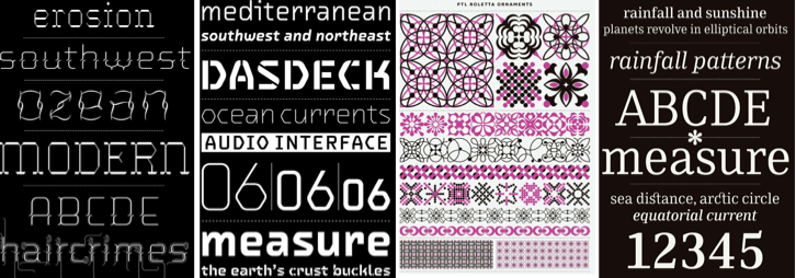
 The layout on the left is quite stunning: using a very minimal colour scheme, they use textures and patterns to create their emotion on the page. They also use pull out pages: I've not really thought about this before in terms of something I could use, and are not necessarily needled but are a break in the conventional pages all the same. With pull out pages you can't help but feel interested as to why they were so important to do this, and it adds another dimension to the page. The middle image is extremely modern: again i think the background colour makes the writing look somewhat striking when compared with the white. They have used negative space freely and the layout looks quite distinct, with a similar text and layout throughout.