Practice Enrichment: Development Sketchbook

Wednesday, 2 April 2014 •

I wanted to share some of my favourite pieces from my development sketchbook here.


Work Based Learning: Development

Saturday, 29 March 2014 •

My initial ideas for the Fostering Company are to use one of the following for a slogan: “Are you tough enough?” which in turn joins on to the idea of Fostering being the toughest job in the world, or “Take the Next Step” to help give people that push to move forward. Research has shown that those who do foster have been thinking of doing so for a long time, and they just need that push and motivation to go ahead.

Practice Enrichment: Experiments part ii.

Thursday, 20 March 2014 •

Anonymity is a huge aspect of Dr Hurt. I want to use this in my final piece, but have yet to find a way to do this. Looking at the way others have produced and taken this idea on, to create a secret identity and manipulate an image to this extent has really helped me to come up with some ideas of this manner.


With Dr Hurt being a super villain, I felt it important to look into dark illustration styles. Paint on black and white images creates this kind of atmosphere, and with the added texture of the brush strokes it looks quite sinister. I wanted to experiment with the idea of the secret identity, and felt hiding the face made this possible. This is one of my ideas for my final piece.


Sandra Chevrier creates intricate illustrations using water colour, and combines them with rippings from pages of comic book strips. Her style is extremely influential and carries both the concept of an image, whilst merging the comic book aspect, without being over the top. I recreated this myself.


I began by scrapping the idea of watercolours, and layering the cuttings on top of a magazine image. I think the colour image with a black and white comic was more effective than the opposite, and I feel it's quite stunning. I also preferred the messy, collaged strips rather than the full image, as they highlight the features of the face more strongly. 

I wanted to try the images exactly the way that Sandra uses them, so I created two quick watercolour images, and added the layers of strips on top. I feel it looks striking, with the print contrasting the softness of the paint and leaving it looking more prominent. 


This is quite an abstract composition. It reminds me of a Picasso piece, with the eyes out of place. The top two images resemble one another, and when ripped through to reveal I feel this similarity is quite intense, bold and charismatic on the page. In contrast, the lower image is half colour and half black and white -- this dynamic looking compelling and mysterious. It reminds me of double exposure, but created in a different way.

I found an image that inspired me to create this, shown in the middle right of the page. Ripping away the eyes of an image, which are often called the “gateway to the soul," to reveal a character. I think this is quite powerful, whilst being extremely simple.

I think after looking through these I have quite a few ideas for my Dr Hurt final. I especially like the idea of ripping away the eyes as I feel it's so incredibly simple, but effective. I want to continue to expand and practice with different processes to create these.

Practice Enrichment: Experiments pt i.

Tuesday, 18 March 2014 •

As mentioned previously, I have experience in working with collages, so felt I should start with this. I began by looking into others collages, and wanted to imitate these styles. Below are two that I felt inspired by: Colour collages. On the top, I cut out magazine advertisements and distorted the shapes, pasting them onto the page to show movement and fluidity. I added a girl above, and then placed text across to make it look less flat.
Below that, I cut out straight lines and circles, colouring them in and layering them on. I wanted this to feel more controlled, and think the lines popping out adds a nice dynamic to the method. Overlapping the layers has given the image depth and makes it look interesting.

From this I felt more confident creating my own collage. Below I created a dark, minimal collage to represent Dr Hurt. I added brown paper to age the article, as Dr Hurt is said to be thousands of years old: adding red to symbolize blood, and black and white to show the balance of good and evil. I also added a girl with black eyes, which is often thought to be demonic, and typography stating “to us, you’re one step from oblivion or one step from triumpth.” Which I feel is fitting for the character, alongside “Drop Dead” and “Liars.” I didn’t want the work to be too obvious.


 Another idea for collage is to stick to lines: but distort. The top image inspired me to imitate this due to the twisted, and quirkiness of the different lengths of the strips. I tried to imitate this but found it was difficult as I hadn't left a focal point, therefore when stretching and lengthening, the image was left with a gap between the strips. 

Below, I found an image that combines two images in strips, similar to double exposure. I think the anonymity is great, and that it is easily identifiable without being obvious, and still holds quite a confusing notion about it. I think this would work quite well for Dr Hurt. 


Practice Enrichment: Research

Thursday, 13 March 2014 •


I was given Dr Strange as my superhero. Dr Strange is a former neurosurgeon turned sorcerer supreme. As he began as a normal person, others find it easy to relate, similar to Batman and Iron Man -- realistic. He is the primary protector of the earth against magical and mystical threats, and draws his powers from mystical entities who lend to a particular effect. 


The primary artist behind his comics, Steve Ditko, based Dr Strange’s adventures on surrealism, creating a distorting and hallucinogenic quality. The adventures take place in bizarre worlds with twisting dimensions that resemble Salvador Dali’s paintings. His comics are bright and colourful. 


Dr Strange has quite a menacing facial expression, which is not the usual superhero look. He has exaggerated eyebrows and a very strong jawline, and these matched with his facial hair look quite wizard like. He wears a red cape, with an amulet around his neck. This matched with the blue of the rest of his costume makes him look quite majestic and royal.


For both of my characters I created a mood board, so I could see what kind of style they feature and could explain them without words. It meant I could look back at this to remind myself of their attributes without having to reread over my notes. For Dr Strange's moodboard, I used his costume colours for the background in tissue paper, and had his silhouette, to symbolize the fact that he is a loner and regularly stays and retreats in the shadows. I drew him in an action pose as I felt this was important, to show him empowered and fighting. In the background was a black and white image of a Salvador Dali painting, and I also incorperated astrological symbols to represent his mystical powers and being a protector of the cosmos. 


Dr Hurt was my villain. I was daunted when researching as he is a little known character, playing a small part within the Batman comic books, but I feel this worked in my favour as it allowed me to experiment and have freedom with the project, and not get inspired by other artists interpretations.

Dr Hurt is an expert is psychiatry and hypnosis. He has been to edit murder victim details so they appear as mentally unstable suicide cases. There is little known about the identity of Dr Hurt, and also much speculation about who he really is. Much of the discussion about this enigma is that he is a supernaturally empowered ancestor of Batman, a devil, a demon, Batman’s long lost twin and finally, his father. I think this anonymity is something I want to play with in my final outcome.


Dr Hurt is considered immortal, though he can be injured. His weapon of choice is a hand gun, and he is not physically very strong. That being said, his strength lies in his wide network of criminals, who he led in the black glove and club of villains against Batman.


In Dr Hurts moodboard, I added the words "Zur En Arrh" which is what he used as the stimulant when hypnotising Batman. I left the background black, and added his face with his prominent mask. I found a silver punctured sheet, and felt the holes actually looked similar to the bottom of bullets, which ties in with his choice of weapon. Adding an inverted image, I felt this looked quite demonic and evil. Finally, I added red to symbolise blood, and the newspaper headline "still hope for survivors." My plan was to cross "still" and write no, but I felt this would be too obvious, and he is a master of psychiatry -- leaving people with hope makes them "weak." It's something he would do, very twisted and deranged. 


Editorial Design: Ideas pt ii.

Friday, 7 February 2014 •

For my initial ideas for the content pages I created a brainstorm, documenting the different styles I could use. One I felt would be quite interesting was inspired by Paula Schers work, who creates maps using typography. 


Paula Scher cuts up pieces of typography from different mediums and lays them out to create the outlines of countries, similar to an atlas. It's quite significant and strange, applying her flair and love for larger scale designs into her work. In some pieces she incorporates vibrant colour, whilst others such as the second image above of Africa, use sepia. 

Taking this style into account I decided to look into other illustrated maps of the place I have chosen. As London is a capital and holds a lot of attention it was easy to come across these: I thought this would be quite a cute idea to distinguish a whimsical style to the page, though it needs to be in keeping with the cover spread, which could be through the use of a colour scheme and typography.


When creating these on the computer I used google maps to understand the layout and style I would like to use, especially as this is just the experimentation phase. I spread the map across the whole of the page, leaving only the margins: I also added circle images on the page to highlight the places, alongside the text below. 


Experimenting more on the map idea, I followed a similar idea with the page as the cover spread, using furniture to highlight the article content. I also continued to add the circles which show photos of the places I have chosen. That being said, I feel that these pages don't fit in to my final idea for a cover spread as I feel it will be difficult to create a running theme throughout, which is something I feel is important.


When looking at trends, I came across a lot of usage of geometric shapes and pages similar to the one above: I find it visually striking with the different images mixing colours, disrupted by the white of the borders. I wanted to recreate this style. 


My first attempt at imitating this was to recreate a similar style, using triangle shapes orientating the page.


I then added furniture and used the images to frame the article content. I personally feel this looks quite effective, though spacing between the triangles may have looked better. I didn't want to settle on this idea, though I do like it and feel it looks quite pretty on the page. 

Again, I like the way the colours go together, and the way the images flowed well but I also felt that the shape didn't give everything it could to the image, often cutting of certain aspects so you couldn't see specific details and couldn't tell what they were of. I feel possibly a square or circle might show more and be stimulating. 

Looking more into different shapes for my images, I created a similar spread to a roll of film, with the images cut off and adding movement. The different sizes create a really nice dynamic but again there is something missing: It doesn't seem to flow well with the front cover. 

Scrapping all original ideas, I decided to try with a black background and a white stripe vertically. I thought this looked very similar styling to the cover spread which was something I wanted to achieve. I added the images of the content in circles, overlapping the white line. Though slightly reminiscent of a certain football team, I really liked the way the page came together. I used Ever After as the type, but felt a lot of it was lost with the difference of white and black.

I adapted that design to create a singular black line horizontally across the page. I liked that the circles were bigger than the line and overlapped, and the typeface was quite contemporary, and not something often found in Editorial design. I think this would look good in a very modern, urban magazine.


Editorial Design: Ideas pt i.

Thursday, 6 February 2014 •

After looking through my research and experiments I decided to start looking into my initial ideas and producing them on a computer to see how they look and come out on screen.


I wanted to mimic the background image, so I created circles of different sizes and colours and changed the opacity, to create the effect of Bokeh. I also experimented with the typography choices I looked at earlier, using Significa which adds to the ethereal, whimsical feel of the spread. Significa is quite a lovely handwritten, italic and cursive font.


In contrast I created a very minimal spread using a black and white image of the eye, alongside a huge number ten. I felt black and white lacked something, though it did look effective: I thought adding content or quotes about London to the image and playing with the curning and tracking of the text would add more dynamic, but after experimenting I felt it looked quite messy.


Similar to the above with bokeh, I decided to look into different shapes. I have seen this style, an opaque shape with text inside (drawing attention to the text from the page) quite often used in blogging and magazines, and it is quite a trend, though usually with a blurred background. It reminded me of snowflakes and christmas, and I felt using a time or season would leave the article looking outdated when viewed later in the year etc, and didn't want it to lose it's touch so quickly.

Another of my ideas was a front cover in which the image spans three quarters across the spread, with the addition of a simple headline and furniture decorating the introduction to the article. I searched around on google images for aerial images of London and found the photographer Jason Hawkes' work, which was stunning, and wanted to use these images in my spread. I like the way the furniture decorated the article and made it stand out, though I also felt something was missing.

Expanding on this, I added a column of black rather than the furniture, and changed the headline to match this: with certain letters in black and others in white, to match the contrast of the background. Again I felt like something was missing, and found that the difference of background colours and columns complicated the page too much. 

Despite this, I decided to add a layer of geometrics on top of the image to experiment with current trends amongst Editorial. I didn't really like the way this looked as I felt it took away a lot of the nice colours of the image and was distracting from the article, making the page look too busy.

Scrapping that idea completely, I kept the image of London, expanding it across the whole page this time, and revisited the earlier idea of opaque shapes to draw focus to the text. As my article is very content based, I felt it would be a nice touch to take the actual article away from the front cover, and focus mainly on the headline. I kept the shape and the title in white.

I didn't really like the title being white as I felt it needed something to connect with the photograph, so I then decided to add the number 10 quite bold and big (similar to the black and white spread I created earlier) in blue. I thought this looked quite a nice touch especially as it actually overlapped the circle, but wanted to experiment further with shapes and lines, though I feel this was one of my strongest ideas. 

Experimenting further, I deleted the circle and added a black line spanning diagonally across the two spreads. I felt the black looked more striking than the white, and the sharpness of the line contrasted the circular shapes of the text. I thought it looked quite nice opaque as you could still see the iconic London skyline, especially the tower bridge through the shape.


Finally, I decided a full black line spanning horizontally across the page was much more effective at creating a focal point for the headline. I left the "10" opaque, and though I lost some of the London skyline, I felt it was still recognisable. I wanted something compelling and unusual, and feel I accomplished this.  


Editorial Design: Layout Research

Monday, 13 January 2014 •

Though researching designers and typographers has really helped me to know what has been called "revolutionary" and some of the aspects of Editorial I need to take into consideration, I feel that it is needed to look at actual editorial spreads to give me more of an idea of a direction I would like to take. Below are some of what I looked at.

The first image about has a nice use of typography, with the letter C being used in place of an image. They have used a backwards drop cap which is different to the norm: I personally think it is quite an interesting idea. They often use white space well, and the layout looks clean and tidy. The second image uses a different way of layouting their magazine: vertically, instead of horizontal across the page. It's interesting, unconventional and different, though possibly impractical due to the research into the way people read, especially in the western world. The image to the right is less of a magazine, and more of a brochure. The page numbers are striking and the use of white space is generous, making the colour look vibrant and eye catching.


The use of a small colour range, paired with focal points marked by quotation marks looks interesting. I like the idea of using a different colour for the page, especially black, which makes the images stand out. That being said, the use of Quotation marks may distract from a pull quote if used. I really like the bottom image spread, with black as the background colour: I feel it's quite striking, especially when mixed with the colour of the photographs.


Typography and photography go hand and hand in Editorial. The use of text in this highlights the face of the image, with text curving in the direction and spacing of cheek bones, spine, and the texture of the hair. I found often in Magazine covers, the writing of the title appears behind the focus of the image. Gradient has been used to create colour, and the type face is similar to bubble and embolden important names and words, with a serif font to describe. Though a cover, I feel incorporating text
into the image in such a creative, fitting way is a brilliant idea.  
The layout on the left is quite stunning: using a very minimal colour scheme, they use textures and patterns to create their emotion on the page. They also use pull out pages: I've not really thought about this before in terms of something I could use, and are not necessarily needled but are a break in the conventional pages all the same. With pull out pages you can't help but feel interested as to why they were so important to do this, and it adds another dimension to the page. The middle image is extremely modern: again i think the background colour makes the writing look somewhat striking when compared with the white. They have used negative space freely and the layout looks quite distinct, with a similar text and layout throughout.
On the right, they use monochrome and a rare use of images, favouring typography and letters instead. Personally I feel the use of no colour looks modern and futuristic. They use quite elegant typography and allow it to decorate the page, which is quite compelling: but even injecting slight colour into it might be more effective and make it look a little more engaging for a reader.

Editorial Design: Research

Sunday, 12 January 2014 •

We were given four influential editorial / graphic designers, and four influential typographic designers to look into as our research task. Though only required to look at 2 of each, I wanted to look at all 8 artists as I felt it necessary to understand what has been done, and what has worked. From looking at these designers, I actually stumbled across more, such as Alexey Brodovitch, Alan Fletcher and Paula Scher, who I also looked into. I feel it's important to research as much as possible to understand the area of Design in more depth.


Neville Brody
He has stated, "I think the objects I leave behind are not the legacy I am interested in. It's whether I can leave behind a thought process." His work is constantly pushing the boundaries and challenging design, fusing typography and photography together to create beautifully executed layouts. He's famous for his work on The Face magazine, where he was allowed to experiment with layouts, spacing and grids. I think what interests me most about his work is, as seen above, he still uses grids and layouts but in a completely different way to what has ever been done before.


Alan Kitching
Renowned for his typography, he uses vibrant colours, overlapping and contrasting. It's his arrangements and textures that make his work so different to others: often imitating the style of a stamp. He doesn't focus on the actual words, but creates a collage from the letters: he also has a history of letterpress printing, and some of his compositions have been created using materials such as wood and metal, which creates this unique style.


Herb Lubalin

Famous for his typographic logo for the Avant Garde magazine, Herb Lubalin's work is iconoclastic. It focuses often on old fashioned type, with a twist. "What I do is not really typography, which I think of as an essentially mechanical means of putting characters down on a page. It's designing with letters." His work is used consistently throughout the design world which could be due to the structure / movement in his typography.

Lance Wyman
Known mainly for his Mexico Olympics logo type, which was extremely popular due to it's simplicity and clever integration of the five ring Olympic symbol. It's based on the sixties kinetic typography, with the use of parallel lines. Specifying mainly in logos, he has also designed the Metro system graphics for Mexico, which he created with pictograms. Each station was identified with a name and colour coded icon, and those icons represented a landmark or activity which is associated where the station is located. These easily aid tourists and those who do not speak the language to travel and are extremely influential.


Stefan Sagmeister

Sagmeister focuses on the concept of his designs, rather than the style. He's been known to use optical illusions, such as his billboard for Levi which featured rotating circles with the words "We are all workers" written. The words were distorted and unreadable when rotating, but came together nicely. He prefers to create for more traditional uses of such as print, rather than online. He has been known to take his designs to extremes, by cutting into his own skin for images, and posing nude: aiming to shock. It's his use of different mediums and extremes that has made him so famously known. He creates art that we can imitate, become attached to, things that are intimate and raw rather than disconnected which is mainly what graphic design has become in this day and age.


Andrea Tinnes
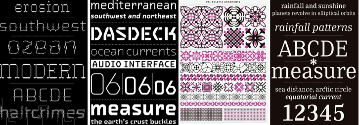
Drawing inspiration from her environments, such as public art to human genetics, Tinnes enjoys creating minimal, simple alterations to conventional fonts. she experiments with weight, space and curves to create her typefaces. Typography is a "visual representation of language" and extremely important in this day and age where it is used to communicate more frequently than ever before. PTL Skopex, her most famous typeface, has been worked on for six years and is claimed to still not be finished. It is simple and clean, combining gothic and serif font: in comparison, Wedding Sans is a contemporary typeface, combining rectangular shapes with round edges for a more futuristic feel.


David Carson
Carson's typography and revolutionary magazine layouts are what has set him above and beyond other designers. With a style often described as grunge and gothic, he uses negative leading, slanting, layering and overlapping letters to get his point across. Often his text is illegible, but he believes "design helps you define the language of the page," and is still incredibly popular. Without breaking the rules of layouts too much, he has been known to use little contrast between the text colour and it's background, deeming it difficult to distinguish. His work makes a page look chaotic without being messy.


Nigel Holmes
Known mostly for his illustrations and animations, he focuses in depth on diagrams and infographics: stating that his main interest has always been explaining things in a simplistic way. His infographics are quite powerful due to the fact they only show what is truly necessary, rather than overcrowding and bombarding with information. He believes that some actions need to be shown in pictures, and others are best expressed through words: a compromise of knowing which road to take, and he does it well.