Illustration and Digital Skills: Final

Monday, 23 December 2013 •

My final piece: I was actually quite pleased with this. I think there are various details that I should have changed, such as the sharp line between the flowers and the background image, which should have possibly curved and blended better, or the flags acting as curtain being too blurry. That being said, I felt I included a variety of different skills and learnt a lot during this module, which is exactly what I set out to produce. I had a huge issue when creating this as I hadn't set up the page size correctly, and the resolution was terrible. I was shown to create the image into a smart object and resize it onto the correct page size that way, but I lost a lot of the crispness and it was no longer as sharp and strong. I think it was good for something like this to happen as I didn't really pay much care or attention to resolution and page sizes before, especially not on photoshop, always thinking I could just resize it: now I've learnt my lesson!
I like that there is no type in the image, nothing to describe exactly what is going on as I feel it does speak for itself. I also find incorporating the Suffragette's theme colours in this way, with three flags coming from one person, allows that person to embody all the women who fought and represent them, whilst not crowding the page. I wanted it to be simple, and adding them all to one person keeps the story without forcing it or making it look too intense.
The floral road was a suggestion from my tutor, and I must admit he was quite right. The image was plain and quite boring before hand, and I feel the flowers are interesting and represent femininity without being too aggressive. I also feel I really took on my research well and you can see a lot of inspiration from what I was drawn to in others work, in mine.
I guess I am pleased with the way this has turned out. It looked a lot better on the computer than printed due to the resolution, but that was a human error and one I have learnt from. I like that you can't tell that the image was a photograph anymore, and the way the sky looks with the subtle paper texture: but I also feel the image is far too busy. I wish I had simplified it more, and am thinking I might continue to develop this into something more. Now my main goal is to continue expanding my knowledge of the programs, and practice the skills I have learnt. 


Illustration and Digital Skill: Techniques

Saturday, 30 November 2013 •

Our workshops are proving to be more helpful than I originally thought they would be. On our very first, we learnt how to create our own workspace: rearranging the windows of photoshop and setting up the tools we would be needing, whilst discarding those we didn't. 
I had never known to do this before! I've always worked with the way photoshop is set up originally, and have always felt frustrated when I've had to open tools and leave them in the middle of the screen. Clearly I didn't know as much about the software as I thought I did.

We then looked at Tonality and Colour, simply changing a womans clothes, hair, hat, and adding makeup. This is something I knew to do before, as in the ye old myspace days I was often found in a dark room retouching photos for myself and my friends. It was definitely nice to be reminded of this skill. 

We then looked at the pen tool: something I dread. I've never been good at keeping a steady hand, and I had always tried to select via the pen tool in freehand, which always turned out awful. I had no idea that holding shift would create a straight line, or that I could create better curves by holding onto the pen tool and moving it. (I understand my explanations are terrible, I am very sorry!) I found that difficult when trying to continue a line where a curve was, and it not wanting to head in that direction: but was told that the simple step of pressing Alt would make that disappear. Far, far easier than I ever thought!

We also looked at creating a clipping mask, which if I am 100% honest, I still have no idea how to do -- Illustrator and I just don't seem to go well together, and I definitely need to work on that. During this tutorial we were also shown where and how to find pantone colours on illustrator. In future, this would be much easier for things such as the branding brief we were given before: I was having to find out the HTML code for each colour so it was all coordinated, whereas just using a pantone colour and being able to save a selection is so much easier, and quicker.

We then experimented with the magic wand, and the quick selection tools, playing around with the refine edge button (that I didn't even know existed!) and had possibly far too much fun with a statue's head. I know that I needed this step for my final piece as it is going to involve a lot of cutting images from their backgrounds, due to using real images of a Suffragette parade, so this was possibly the most helpful step I learnt. I also looked into a few other ways of doing this, such as creating a mask and painting over the image: when the mask is added, the image is all that is left, and the background has been cut away. Quick, simple, and Beth-friendly.

My personal favourite tutorial we learnt was creating a magazine spread. Editorial has always been interesting to me: in many ways, it is the area in which I would like to specialise. I look at a lot of magazines such as Oh Comely, Company, Kinfolk, Lionheart, who are all very artistic and creative and it is an area I absolutely love. So in learning better skills on inDesign was definitely the highlight of this module for me.

I feel that these workshops have truly helped me better my skills: especially with on hand help. Internet tutorials are great, and extremely handy, but having someone there to talk to and explain certain steps so you grasp it better and truly understand what it is you are doing is so much easier to remember.

Durham Lumiere

Thursday, 14 November 2013 •


I headed to Durham's Lumiere festival -- modern art is extremely confusing to me, but is also an experience I love. I feel it's important to go to these kinds of events, especially when studying an art and design degree, as it's usually in keeping with the times and trends. I'd never been to this before and it was wonderful to see Durham lit up and decorated in pieces of artwork, like above, a sign that was above the streets saying "A Place Beyond Belief" by artist Nathan Coley, which recalls a testimony of a woman from 9/11.


The two pieces above caught my eye. As it was during the run up to Christmas, a tree was placed in the middle of the town, created solely out of plastic bags to show consumerism and our addiction to plastic bags, making us consider the environmental consequences of these which are so often discarded, at the time of year where we purchase more than any other. This was complimented by plastic bags acting as christmas lights hanging above the streets, and though quite a daunting and downhearted message, it was truly quite beautiful. On the right is something much more up beat and lively, a piece called "KeyFrames" which was men illuminated and dancing on top of the former Durham Miners Hall. It was very quirky and fun and had most people laughing and dancing along.


As usual, the Cathedral was lit up and played a story of it's history, called "Crown of Light." Featuring images from the Lindisfarne Gospels, it was incredibly beautiful as it spanned the images across the whole front, with movement and music helping to bring it to life. I was in awe.

The very first piece I saw was these tents. It truly set me up for the rest of the night: extremely quirky and cute, El Sol was a tribute to Durham's brass band heritage, and was interactive and ethereal. Each tent had an image of a musician and played music as you walked passed. Apparently when looking above you could see the significance of the way the tents are laid out.

It's really quite wonderful to see these kinds of events happen so close to home, and I felt I learnt a lot about Durham in an unusual way, whilst also having a lot of fun. Museums are great but are found everywhere nowadays, so this is a great way to get everyone learning and interested in heritage: especially as Durham is such an old city, with a lot of architecture remaining from hundreds of years.

llustration and Digital Skills: Research

Monday, 11 November 2013 •

Our research task was to carry out an in depth visual research into other illustrators. Again, using my pinterest account to collate the images in one place, I looked at certain illustrators whose works I already knew such as Silvia Pelissero, Sophie Blackall and Gregory Euclide.


In the case of Sophie Blackall, I thought she would be a great example to look at as she personally illustrates stories into wonderful pieces of artwork which are simple and easy to read. Sophie takes anonymous missed connections that are posted on Craigslist and turns them into very ethereal, warm artworks: the kind you could see in a childrens book, very simple and strange. She incorporates Chinese ink, watercolour and sometimes photoshop. Looking at how others take stories and portray them visually is helping to see the ways I could personally portray my own London story: Sophie manages to portray a story of any kind without much explanation, solely relying on the imagination of a person. I feel that's something I'd like to incorporate into my own work.

What's also interesting about Sophie Blackall's work is that she works mainly with people, stories that capture the spectrum of human emotions: raw and longing. It's that that I feel I need to capture due to my story being about feminism and women fighting for their rights.


Silvia Pelissero, otherwise known as Agnes Cecile, creates monotone and heavy illustrations using enamel paint. She uses movement throughout all of her illustrations, which compliments her style of work, capturing a story and emotion within. They mainly focus on portraits, using colours that reflect these expressions: changing to bright for intimate illustrations and cold and monotone to express natural and raw.


Personally I think colour can sometimes be quite overpowering when used in bright and vibrant shades, but when looking in these images she has toned that down using white lines to out line the different paint strokes. This small, simple addition creates a dynamic that is brilliant within her images and looks extremely beautiful.


Gregory Euclide uses paper arts in his work. I know of him due to creating the album artwork for Bon Iver, but after researching more in depth I found that he was in fact a teacher, and began creating art on his whiteboard in class, as seen below. Incredibly, most of these took 25 minutes to create. He focuses on landscapes, creating realistic and detailed imagery, to very surreal and bizarre. He integrates painting and elements of nature into his work to create authenticity: looking at the more intricate details, he has often crumpled the paper to create texture and movement whilst adding structures, leaves and bark to create 3D imagery. A lot of this aspect is lost when photographed, though despite this they still look incredibly charismatic and intimate. he also uses very natural and organic colours which follows the theme of the imagery.


All three of these artists produce very different styles of work, though I feel I need to look more in depth in terms of mixed media and digital illustration. That being said, I already feel quite inspired by Sophie Blackall's style which I believe I could incorporate into my own image, possibly taking the use of pastel colours which are very soft and whimsical, and use that colour palette myself. I definitely want to look into more artists who are similar to Gregory Euclide, building up a dynamic by manipulating paper. I think this is extremely interesting, though I also need to remember that this module and brief is about developing digital skills, and can not all be hand rendered.

Illustration and Digital Skills: SWOT Analysis

Tuesday, 5 November 2013 •

Before starting this project I thought it best to create a SWOT Analysis to know exactly what it is I want to accomplish and where I need to expand on.

Strengths
I personally think my strength is photoshop. I have previous experience with the program and used it quite often in my first project, therefore I feel quite confident when using it.

Weaknesses
I feel Illustrator is most definitely my weakness. I've never used the program before, and I think subconsciously I've always tried to avoid it. I want to learn skills via the workshops we are going to be given throughout this module and practice until I feel more comfortable with the software.

Opportunities
Having workshops to learn and apply our skills is an opportunity: being taught by many who have spent their life using such technology and programs is helpful, especially when they are on hand so often -- I intend on taking full advantage of my lecturers knowledge. Also having the software at home and on my own computer is an advantage as I can keep on top of the work I am producing and make sure I am up to speed. 

Threats
Forgetting / not backing up my work, or similarly, forgetting to save and possible crashes to computers. I've had this happen before far too many times and feel I've grown quite wary of technology due to this. Another threat is not meeting the deadline, so time keeping and organisation will be key. 

Illustration and Digital Skill: Brief

Saturday, 2 November 2013 •

Our second brief is on Digital Skills Acquisition. We are also required to create an illustration narrating and portraying famous stories of London: fact, or fiction. My initial choice of story was Mary Poppins, as it has so many different aspects of London within, but I found it difficult being so broad. It is also quite overdone, and I felt I would find it difficult to create an original piece without looking similar to a movie poster or something already produced. I created a brain storm on the story, and chose one of the strings within: The Suffragettes. I feel the Suffragettes is quite an interesting one as the bravery of women is what helped me to have the freedom I do right now. As a female it is a story that has affected the way my life is, and allows me to live the way I would like to live, therefore being very personal. I want to make the outcome feel feminine and strong, though I'm not too sure which direction I would like to take with this yet. 

Branding and Cooperate Image: Final.

Tuesday, 29 October 2013 •

In completing my brand identity, I was quite pleased with the way it turned out. I wanted to incorporate the actual loft logo, which I recreated using illustrator, and added lights surrounding it: creating a similar effect to flashing lights. When I thought of events, I thought of high end, paparazzi, red carpet style launches and wanted to replicate this in the logo. I used light colours to highlight against a black background, such as a light blue, white and grey.

The touchpoints I decided to create were a letterhead, a business card, a brochure and a compliment slip alongside a balloon to place inside the slip. I felt the compliment slip was my weakest: though inkeeping with the style and still using the logo, I felt the blue was washed out with the grey and white, and should have been on black card and embossed. I wanted the letter head to be extremely simplistic and felt I achieved this. 


 I chose to use two simple fonts to compliment one another in the brochure and logo: Ever After, and F37 Bella in Stencil. Though going against what I said earlier, with Stencils being a very current trend, I felt it is something that will never go out of style and the font face of F37 Bella with it's curves and sans serif, really added a difference and stood out.

Again, showing the colours I chose: a pale blue, a teal, and black. My brand drivers were Creative, Focused, Ambitious, Sophisticated, Open and Bespoke. 

I also really like the way the business card came out: originally using just the logo similarly to the letter head, I added some of the effect that was behind the image in the logo, but this time on top, creating quite a nice dynamic on the page. 


Apologies for the quality of these photos: I created the brochure using In Design. I wanted the brochure to feel quite up market, but also to attract all clients, using imagery provided on the website, alongside images of the place it is situated in. I used both typefaces mentioned earlier, and included the logo stretching half the page for the front. 

Finally, I was required to create a mood board summing up my development work from my sketchbook. I used colours I wanted to work with, research into different events companies, and my research into branding and touchpoints. It's difficult to sum up your research and development without using words, but moodboards are a really effective method of collating all of your research into something extremely simple and undestandable.

Overall, for a first module I feel I've accomplished a lot: though I want to work on my photoshop and illustrator skills in more depth, as I've never truly used them in this way before.


Branding and Cooperate Image: Touchpoints II.

Friday, 25 October 2013 •

Continuing my research on touchpoints, after looking at various companies and how they tackled business cards, I decided to look into actual events companies and the kinds of touchpoints they have used. Looking into similar companies is extremely important as it allows you to see what works, and what doesn't, in that market.

This event company has used quite nice copywriting with a compliment slip saying "thank you for letting us light up your night." Which ties in with the rest of the touchpoints, using the words "Light up your night." It's a great idea as it's very simple, but describes exactly what the company does without writing very obvious statements, such as "we are an events company." I really like that the copywriting ties in with the image, a lightbulb, and that the company's name isn't big and bold on the page, very subtle and rare use.


Quite a few of the companies have brochures detailing exactly what the company does and the services they provide, alongside images of the space. I feel this one touchpoint that is mandatory for this kind of business, so I wanted to look at ways others had accomplished this. I found the folder quite a nice touch, especially as it also decorated with typography, whilst keeping everything together in once place. It draws focus to what's inside, whilst not looking out of place and insignificant.


Similarly to the post below, this company has used a personalised balloon as a touchpoint. I using confetti, balloons, party poppers, whistles etc -- things you would find at a party, might be fitting for a company of this nature, though it may also be seen as childish. It's an idea I would like to play with though, as it's a similar notion to favours you receive at a wedding: something to remember, a thank you, something to take with you. This could go nicely with a compliment slip.


And finally: this company has used some captivating touch points, such as a personalised event staff card to attach to a lanyard, that is in keeping with the rest of the identity. It could be useful providing that they would like the event organisers / company to provide the staff, but if the actual event wants to find and employ it's own, surely the event staff lanyards should be that of the event and what is about. This is a possibility. They have also created cards which allow guests to write their name upon them -- I'm unsure if they are stickers. I feel this should be left for the actual organisation of the event rather than a touchpoint for the company, mainly because it is only fitting to use these for certain events such as training days and what not, rather than launches, and from what I gathered at the client meeting, Loft want to hold all different kinds of events. 

Looking at these, I personally feel my strongest idea for touchpoints are a brochure, a business card, and a compliment slip due to it being personal and acknowledging and showing courtesy to a client.

Branding and Cooperate Image: Touchpoints

Wednesday, 23 October 2013 •

When creating a brand identity, touchpoints play a huge part. They should match a brands theme, and aid the brand in getting it's name identified amongst the rest. We are required to create three touchpoints for the brand, alongside the logo and brand drivers. One touch point I believe quite necessary to a business is a business card, as it is a simple and effective way of giving out contact details to clients. I decided to look into innovative business cards that are interactive and describe the company or person well. 


A cheese grater as a business card: You can quit clearly guess what this company specialises in, and it is also a cute way of interacting with clients and leaving a lasting memory on them. It could also be a hazard... I know a lot of people store business cards in wallets, and I imagine trying to find a credit card and what not might be a bit disastrous with this in there!


A business card that doubles as the wrapper of a chocolate. I'm going to guess this company is some sort of chocolatier, which is great as it also allows clients and companies to test the products, whilst holding your details. That being said, if they don't straighten out the wrapper, which I doubt many people do after scoffing chocolates, this might not work as well as they'll just throw your details straight in the bin. 


This triples as a business card, a comb and what I do believe is a layout similar to a keyboard. Pretty great for keeping in your purse or wallet to get rid of fly away hairs, but I do feel the writing seems a little bit on the small side. That could just be the image!


A very simple way of getting a point across. It's quite effective that a chest / lung physician would use balloons to store his details on, though could be a hindrance as you need to blow it up before you can see: If someone really needs this kind of doctor, theres a huge possibility they will struggle to do so. 


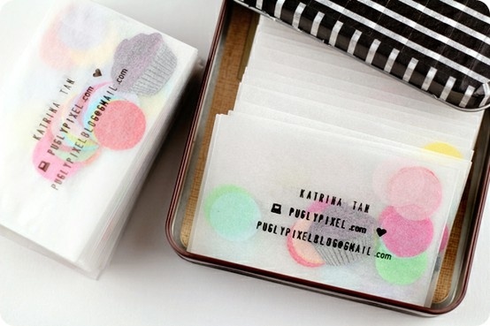
And finally: this would be quite lovely for an events company -- confetti in a glassine envelope, with the details stamped on the front.


Looking at the way other companies have applied creativity and personalised their business cards has really made me want to do something similar. Laser cutting and embossing are things I need to think deeply about. 

Branding and Cooperate Image: Client Meeting.

Sunday, 20 October 2013 •

As this is a live brief, and we are working with an actual client and producing work for them, it was necessary to meet with them. We headed to Loft Studios, where we were delivered the brief once again but were able to ask questions and query certain aspects of the company and brief, and requirements of the company.

I had never been in a situation similar to this before, so it was quite a daunting experience, but helpful nonetheless. I personally felt I learnt more about the company after looking around at the space in person, rather than images, and being able to personally interact with the owners made me more at ease and clued in to the brief. I felt the space was quite rustic, very wooden and old fashioned, whilst being very simple and plain: hence why it is a great event space. This could be something I could incorporate. I also found out a lot about the history of the company, and also that they would like the Event's side of the company to be advertised and branded as a completely separate identity to the rest of the brand. That being said, they'd also like it to flow with the company and should still be in keeping. Obviously I have quite a lot of freedom with this brand.

Branding and Cooperate Image: Research

Thursday, 17 October 2013 •


Researching into Branding and Cooperate Image, I found a lot of trends and inspiration – collecting it on Pinterest to look back upon. It's quite easy to see a lot of similarities amongst images when collating this way, for example:

Both of these brands have incorporated a mixture of colours into their identity. One uses texture and patterns to define themselves, whilst the other uses opacity and letters. Both have used very vibrant, bright and a variety of colours, rather than sticking with one.

In contrast to the above, all three of these brands have used a singular colour to define themselves. There is a huge trend of the use of red amongst food companies, though they have all accomplished very different viewpoints and touchpoints within their identity.


Finally, a third trend I found was the use of chalkboards and monotone colours. Both of these brands have used a similar technique to identify their image, with typography playing a huge part.
Another trend I found very popular at the moment was the use of stamps and rustic imagery. These trends sit well with the companies they are created for, but they are also just that: a trend. Extremely modern, and coming in to fashion with the times. The issue I have with finding inspiration amongst these is that I would like what I come up with to stay in fashion even when these trends change, and to be in keeping with the company. As there are many different strings attached to the company, as stated before in my introduction to the brief, I need to be extremely careful in making sure they flow well together. 

Branding & Cooperate Image: Week One.

Sunday, 13 October 2013 •

For our first module, we are required to create a brand new identity system for a client, Loft Music Studios. We began by researching into current trends in Branding, via the use of Pinterest. I found that some of the most interesting and commonly used trends were: Stamps as logos, Blackboard paint, and Geometric shapes. Although I actually love all of these ideas, I have decided to try and steer clear of them in my work as they are very modern and fashionable, and may not stand the test of time. I also looked at the future of branding, and how people are adapting to technology, such as the use of iPad and iPhone apps.
We were then divided into the different areas of the company, and I decided to choose Events. I feel that I was drawn most to this side of the business as there was so much potential in the brief, especially after meeting the client. As described, it should be advertised as a completely separate company, and therefore we have a lot of freedom in terms of designing a new concept. With that being said, it does need to be appropriate and match all the clients requirements.
I feel confident in the project at hand, but do wish I had had the chance to expand my digital skills before beginning. Despite this, I feel that after starting the initial scamp sketches, I have a better idea of the direction I would like to take. I now need to begin thinking more in depth about touch points, but I am happy with the place I am at currently.