Branding and Cooperate Image: Final.

Tuesday, 29 October 2013 •

In completing my brand identity, I was quite pleased with the way it turned out. I wanted to incorporate the actual loft logo, which I recreated using illustrator, and added lights surrounding it: creating a similar effect to flashing lights. When I thought of events, I thought of high end, paparazzi, red carpet style launches and wanted to replicate this in the logo. I used light colours to highlight against a black background, such as a light blue, white and grey.

The touchpoints I decided to create were a letterhead, a business card, a brochure and a compliment slip alongside a balloon to place inside the slip. I felt the compliment slip was my weakest: though inkeeping with the style and still using the logo, I felt the blue was washed out with the grey and white, and should have been on black card and embossed. I wanted the letter head to be extremely simplistic and felt I achieved this. 


 I chose to use two simple fonts to compliment one another in the brochure and logo: Ever After, and F37 Bella in Stencil. Though going against what I said earlier, with Stencils being a very current trend, I felt it is something that will never go out of style and the font face of F37 Bella with it's curves and sans serif, really added a difference and stood out.

Again, showing the colours I chose: a pale blue, a teal, and black. My brand drivers were Creative, Focused, Ambitious, Sophisticated, Open and Bespoke. 

I also really like the way the business card came out: originally using just the logo similarly to the letter head, I added some of the effect that was behind the image in the logo, but this time on top, creating quite a nice dynamic on the page. 


Apologies for the quality of these photos: I created the brochure using In Design. I wanted the brochure to feel quite up market, but also to attract all clients, using imagery provided on the website, alongside images of the place it is situated in. I used both typefaces mentioned earlier, and included the logo stretching half the page for the front. 

Finally, I was required to create a mood board summing up my development work from my sketchbook. I used colours I wanted to work with, research into different events companies, and my research into branding and touchpoints. It's difficult to sum up your research and development without using words, but moodboards are a really effective method of collating all of your research into something extremely simple and undestandable.

Overall, for a first module I feel I've accomplished a lot: though I want to work on my photoshop and illustrator skills in more depth, as I've never truly used them in this way before.


Branding and Cooperate Image: Touchpoints II.

Friday, 25 October 2013 •

Continuing my research on touchpoints, after looking at various companies and how they tackled business cards, I decided to look into actual events companies and the kinds of touchpoints they have used. Looking into similar companies is extremely important as it allows you to see what works, and what doesn't, in that market.

This event company has used quite nice copywriting with a compliment slip saying "thank you for letting us light up your night." Which ties in with the rest of the touchpoints, using the words "Light up your night." It's a great idea as it's very simple, but describes exactly what the company does without writing very obvious statements, such as "we are an events company." I really like that the copywriting ties in with the image, a lightbulb, and that the company's name isn't big and bold on the page, very subtle and rare use.


Quite a few of the companies have brochures detailing exactly what the company does and the services they provide, alongside images of the space. I feel this one touchpoint that is mandatory for this kind of business, so I wanted to look at ways others had accomplished this. I found the folder quite a nice touch, especially as it also decorated with typography, whilst keeping everything together in once place. It draws focus to what's inside, whilst not looking out of place and insignificant.


Similarly to the post below, this company has used a personalised balloon as a touchpoint. I using confetti, balloons, party poppers, whistles etc -- things you would find at a party, might be fitting for a company of this nature, though it may also be seen as childish. It's an idea I would like to play with though, as it's a similar notion to favours you receive at a wedding: something to remember, a thank you, something to take with you. This could go nicely with a compliment slip.


And finally: this company has used some captivating touch points, such as a personalised event staff card to attach to a lanyard, that is in keeping with the rest of the identity. It could be useful providing that they would like the event organisers / company to provide the staff, but if the actual event wants to find and employ it's own, surely the event staff lanyards should be that of the event and what is about. This is a possibility. They have also created cards which allow guests to write their name upon them -- I'm unsure if they are stickers. I feel this should be left for the actual organisation of the event rather than a touchpoint for the company, mainly because it is only fitting to use these for certain events such as training days and what not, rather than launches, and from what I gathered at the client meeting, Loft want to hold all different kinds of events. 

Looking at these, I personally feel my strongest idea for touchpoints are a brochure, a business card, and a compliment slip due to it being personal and acknowledging and showing courtesy to a client.

Branding and Cooperate Image: Touchpoints

Wednesday, 23 October 2013 •

When creating a brand identity, touchpoints play a huge part. They should match a brands theme, and aid the brand in getting it's name identified amongst the rest. We are required to create three touchpoints for the brand, alongside the logo and brand drivers. One touch point I believe quite necessary to a business is a business card, as it is a simple and effective way of giving out contact details to clients. I decided to look into innovative business cards that are interactive and describe the company or person well. 


A cheese grater as a business card: You can quit clearly guess what this company specialises in, and it is also a cute way of interacting with clients and leaving a lasting memory on them. It could also be a hazard... I know a lot of people store business cards in wallets, and I imagine trying to find a credit card and what not might be a bit disastrous with this in there!


A business card that doubles as the wrapper of a chocolate. I'm going to guess this company is some sort of chocolatier, which is great as it also allows clients and companies to test the products, whilst holding your details. That being said, if they don't straighten out the wrapper, which I doubt many people do after scoffing chocolates, this might not work as well as they'll just throw your details straight in the bin. 


This triples as a business card, a comb and what I do believe is a layout similar to a keyboard. Pretty great for keeping in your purse or wallet to get rid of fly away hairs, but I do feel the writing seems a little bit on the small side. That could just be the image!


A very simple way of getting a point across. It's quite effective that a chest / lung physician would use balloons to store his details on, though could be a hindrance as you need to blow it up before you can see: If someone really needs this kind of doctor, theres a huge possibility they will struggle to do so. 


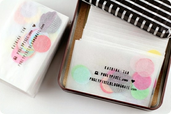
And finally: this would be quite lovely for an events company -- confetti in a glassine envelope, with the details stamped on the front.


Looking at the way other companies have applied creativity and personalised their business cards has really made me want to do something similar. Laser cutting and embossing are things I need to think deeply about. 

Branding and Cooperate Image: Client Meeting.

Sunday, 20 October 2013 •

As this is a live brief, and we are working with an actual client and producing work for them, it was necessary to meet with them. We headed to Loft Studios, where we were delivered the brief once again but were able to ask questions and query certain aspects of the company and brief, and requirements of the company.

I had never been in a situation similar to this before, so it was quite a daunting experience, but helpful nonetheless. I personally felt I learnt more about the company after looking around at the space in person, rather than images, and being able to personally interact with the owners made me more at ease and clued in to the brief. I felt the space was quite rustic, very wooden and old fashioned, whilst being very simple and plain: hence why it is a great event space. This could be something I could incorporate. I also found out a lot about the history of the company, and also that they would like the Event's side of the company to be advertised and branded as a completely separate identity to the rest of the brand. That being said, they'd also like it to flow with the company and should still be in keeping. Obviously I have quite a lot of freedom with this brand.

Branding and Cooperate Image: Research

Thursday, 17 October 2013 •


Researching into Branding and Cooperate Image, I found a lot of trends and inspiration – collecting it on Pinterest to look back upon. It's quite easy to see a lot of similarities amongst images when collating this way, for example:

Both of these brands have incorporated a mixture of colours into their identity. One uses texture and patterns to define themselves, whilst the other uses opacity and letters. Both have used very vibrant, bright and a variety of colours, rather than sticking with one.

In contrast to the above, all three of these brands have used a singular colour to define themselves. There is a huge trend of the use of red amongst food companies, though they have all accomplished very different viewpoints and touchpoints within their identity.


Finally, a third trend I found was the use of chalkboards and monotone colours. Both of these brands have used a similar technique to identify their image, with typography playing a huge part.
Another trend I found very popular at the moment was the use of stamps and rustic imagery. These trends sit well with the companies they are created for, but they are also just that: a trend. Extremely modern, and coming in to fashion with the times. The issue I have with finding inspiration amongst these is that I would like what I come up with to stay in fashion even when these trends change, and to be in keeping with the company. As there are many different strings attached to the company, as stated before in my introduction to the brief, I need to be extremely careful in making sure they flow well together. 

Branding & Cooperate Image: Week One.

Sunday, 13 October 2013 •

For our first module, we are required to create a brand new identity system for a client, Loft Music Studios. We began by researching into current trends in Branding, via the use of Pinterest. I found that some of the most interesting and commonly used trends were: Stamps as logos, Blackboard paint, and Geometric shapes. Although I actually love all of these ideas, I have decided to try and steer clear of them in my work as they are very modern and fashionable, and may not stand the test of time. I also looked at the future of branding, and how people are adapting to technology, such as the use of iPad and iPhone apps.
We were then divided into the different areas of the company, and I decided to choose Events. I feel that I was drawn most to this side of the business as there was so much potential in the brief, especially after meeting the client. As described, it should be advertised as a completely separate company, and therefore we have a lot of freedom in terms of designing a new concept. With that being said, it does need to be appropriate and match all the clients requirements.
I feel confident in the project at hand, but do wish I had had the chance to expand my digital skills before beginning. Despite this, I feel that after starting the initial scamp sketches, I have a better idea of the direction I would like to take. I now need to begin thinking more in depth about touch points, but I am happy with the place I am at currently.